Interface design assignment
Motivation
The motivation for this work is to create a design for an application that will help people
pay attention to what and how much they eat. The idea is based on a quote from Peter Drucker -
What gets measured gets managed.
The Hungie app is therfore used to monitor calories and record meals. The app can function
eaither as a tool to improve onse lifestyle or as a simple food diary.
Goals
The goal is to design the front end of a simple app for recording meals. The application
should be as clear as possible so the user will not get discouraged from making regular
entries. If everything takes too long, the user will lose interest.
Long story short, the main points of this design are:
- Create a design for a food diary app
- Provide users with a tool to quickly record meals and allow users to deal with the details later
- Let the users specify the location of the entry on the map
- Give the users the opportunity to remember the good foods of the past
Use Cases and Scenarios
Use case 1
- The user goes through initial settings on the first laucnho of the app.
- The user expexts the system do display the main page.
- The user expects to be able to add an entry and to go through the history of saved records on the main page.
- The user requests the ability to swithc between the main page and the sub pages.
Scenario 1
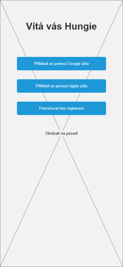
- The system shows options for registration or login using the user's Google or Apple accounts on the first launch. There is a welcome sign at the top, and an image in the background.
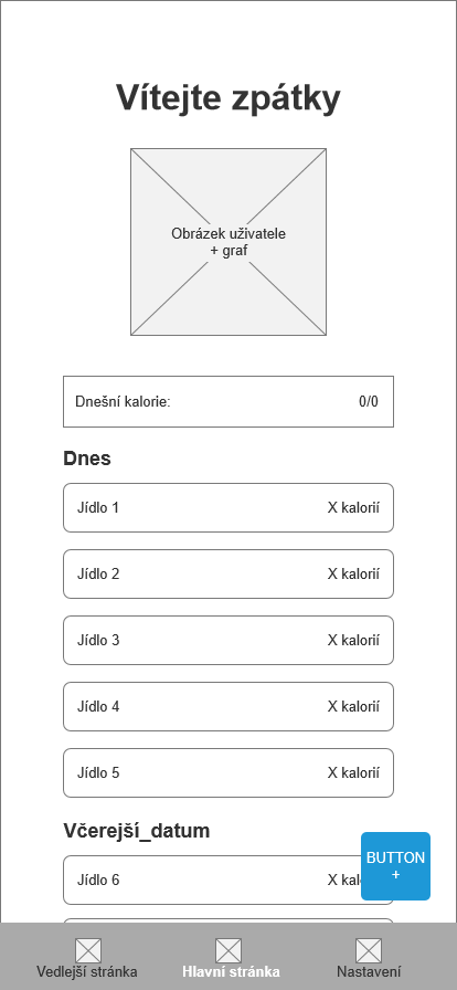
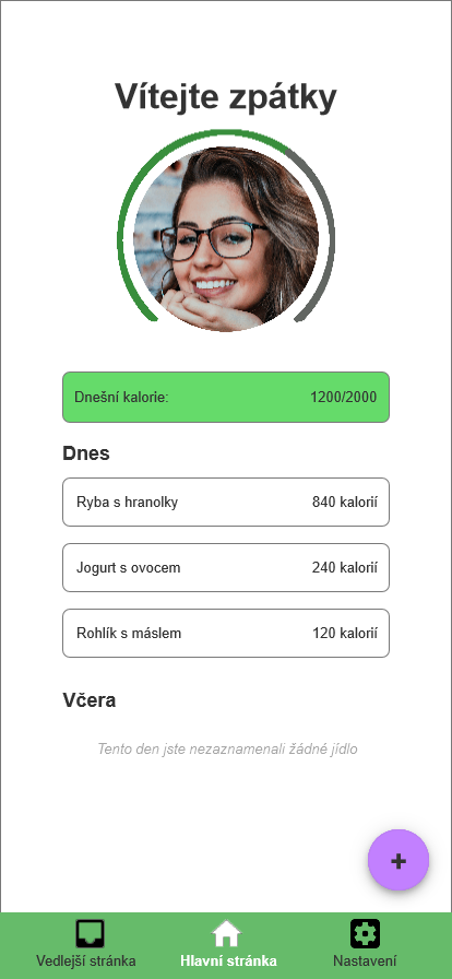
- The system shows the main page of the app.
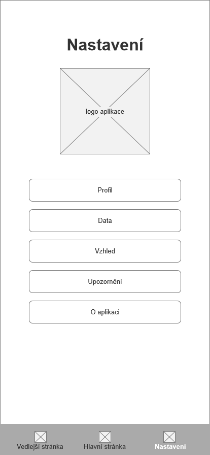
- On the top of the main page there is user's profile picture and a graph showing the percentage of todays consumed calories.
- There is a calory counter near the middle of the screen. Under that lies a list of eaten meals sorted by the date and time.
- In the bottom right corener is a button for making a new entry.
- The navigation bar is at the bottom of the screen for ease of use. The bar allows the user to switch between the app screens.
Use case 2
- The user expects the system to show the details of records.
- The user requires the ability to edit or delete the details of entries.
Scenario 2
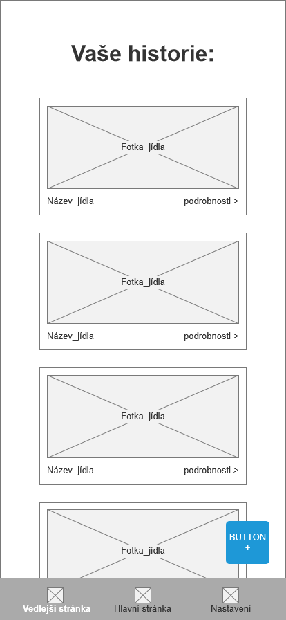
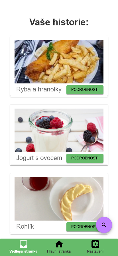
- The system displays cards with meals, sorted by the time of the record.
- The cards contain picture of the meal, name and a button that leads to details page.
- There is a search button in bottom right of the screen.
- The system shows a new page with meal details on a click on the details button on any card.
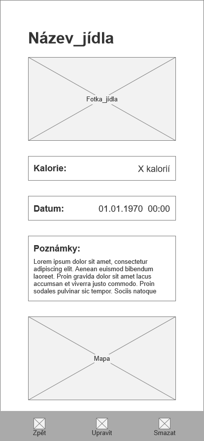
- The details page contains the meal name on the top, followed by its picture, number of calories, date and time of the record, notes and a map with location of the entry, if it was added.
- The system shows buttons for editing or deletion of the record in place of the app's nav bar.
- If user taps on the delete button, the system shows a warning with a confirmation button.
Use case 3
- The user wants to be able to add new records, change the name, number of calories, notes, picture and location.
Scenario 3
- On the main page the system shows a button for adding a new meal.
- System waits for user to press the button.
- After the add button is pressed, the system shows a new windows with title "New recording" and fields for the details.
- To add the details, the system waits for the user to tap into the specific field of the detail.
- The detail fields are, from top to the bottom, picture of the meal, name, number of calories, date, notes and a map.
- The only required field is the name of the meal. The date and time is filled automatically. The rest of the details can be added later.
- The system shows two buttons in the place of the app's nav bar. The first is to save the record, the other is to retur to the main page without saving.
- If the user decides to tap on the return button, the system shows a warning - the data wonn't be saved. Under the warning there are two buttons, one returns the user to the new record screen, the other leads the user to the main page.
Logical design
Here you can see the logical designs of:
- The splash screen
- The main screen
- The secondary; screen
- The details page
- The settings page
in this order.
Graphical design
Here you can see the graphical designs of:
- The main screen
- The subecondary screen
in this order.